01 | At a Glance
- What was wrong. Raw clicks and business steps looked identical in one flat list, so on a long session an analyst lost track of both where they were and what they were looking at.
- What I did. Split the interface into time and structure, gave each one an anchor that never moves, and kept the two in sync.
- Where it ended up. Six screens, three edge cases and three flows, built so that reaching a timestamped piece of evidence takes two clicks rather than a scroll through 342 rows.
02 | Project Overview
Skan.ai is a process intelligence platform. It sits on enterprise desktops and records how people actually work across SAP, Salesforce and ServiceNow, then turns that raw capture into a picture of how a business process really runs.
Participant Clickstream is the forensic end of that platform. An analyst opens one recorded session, replays it, and inspects the exact sequence of actions the person performed. It is the screen you go to when a process metric looks wrong and somebody has to explain why.
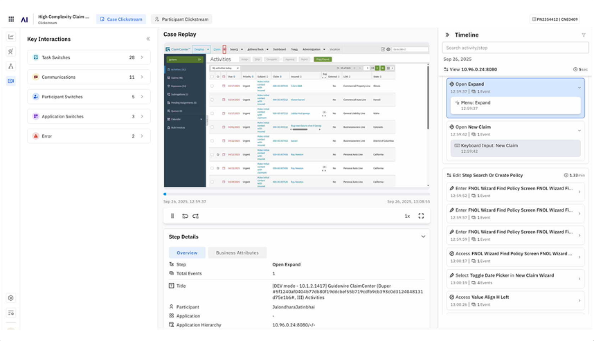
The feature had grown one release at a time. Raw system events and high-level business steps rendered as identical rows in one flat list. There was no way to see where an event sat in the six-level process hierarchy while also tracking where you were in the session timeline. On a long session, people lost their place, and then lost confidence in what they were looking at.
I had the feature specification, the platform's public product, and no access to real users. Defining the analyst was part of the work.
03 | The Problem
The interface answers where you are in the session, but leaves the analyst to work out where they are in the process.
The core problem, as I framed it, was that an analyst reviewing a captured workflow has to answer three things at once. What happened, which is the event. Where it happened, which is the process hierarchy. And how that event contributes to a higher-level business step, which is the link between the two.
The existing interface answered the first question well and left the analyst to reconstruct the other two in their head, one row at a time. On a session of a few dozen events you can hold that in your memory. On a session of three hundred and forty two, you cannot.
So I reduced the whole thing to a rule I could design against. Every screen has to answer two questions without being asked.
- Where am I in this session? That is time.
- Where am I in the process? That is structure.
Those two answers need separate homes. Trying to serve both of them from one scrolling list is what broke the original.
What the shipping product already told me
Two problems were visible in the live product without needing a single user interview. Event labels truncate mid-sentence, so a row ends in an ellipsis and tells you almost nothing about what the person did. And the step detail panel surfaces raw system values, an IP address and a port string, in a place that is supposed to carry business meaning.
Poor information hierarchy and no clear mapping between a user action and the business step it belongs to. Both of them sitting in plain sight, in the interface itself.
04 | The User
No persona was given to me. Defining one was part of the problem.
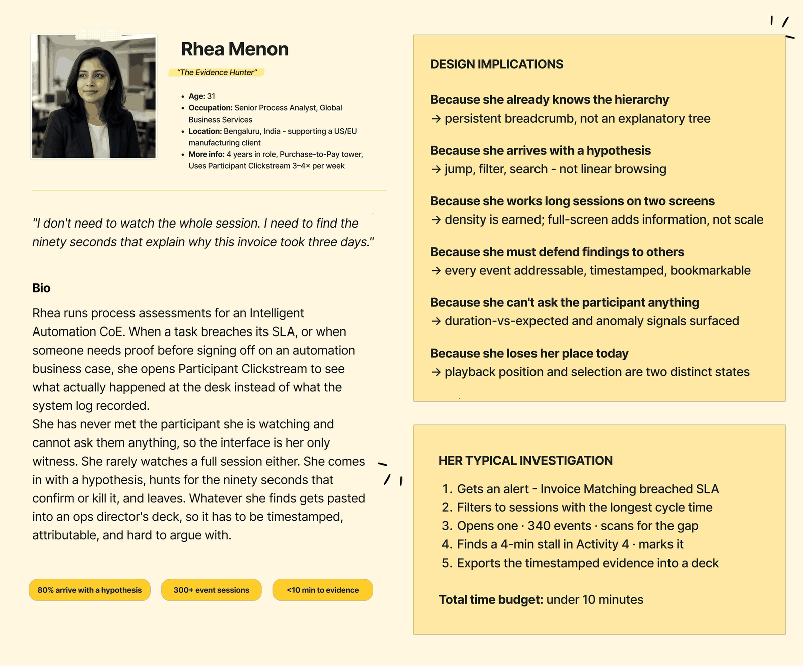
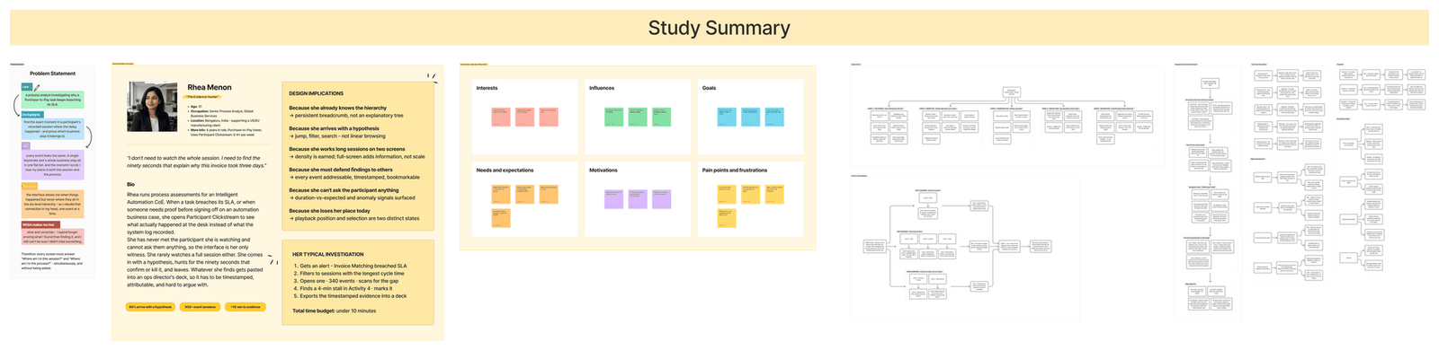
I had no users to talk to, so I built her out of the use cases in the specification plus what I could find about how analysts in finance operations spend their day. She is a working assumption, not a research finding. I am saying that up front because the rest of this page leans on her, and I would rather you know what she is built on than have you take her for something she isn't.
Rhea Menon
Senior Process Analyst · Global Business Services, Finance Operations
Purchase-to-Pay · Intelligent Automation CoE · uses this feature regularly, not occasionally
How I imagined she'd describe the job
"I don't need to watch the whole session. I need to find the ninety seconds that explain why this invoice took three days."
What I assumed about her, and what each assumption changed
| What I assumed | What it changed |
|---|---|
| She already knows the six-level hierarchy by heart | A persistent breadcrumb rather than an explanatory tree |
| She usually arrives with a hypothesis rather than browsing to see what turns up | Jump, filter and search lead. Linear browsing is the fallback |
| She works long sessions on two screens and reaches for the keyboard first | The layout earns its density. Full screen adds information rather than scale |
| She has to defend a finding in somebody else's deck | Every event is addressable, timestamped and bookmarkable |
| She can never ask the participant a single question | Duration against expected and anomaly signals sit up front |
| She loses her place in the current tool | Playback position and selection stay two separate visual states |
Every row in that table turns up later as something you can point at on a screen. If an assumption didn't change anything, I took it out.
05 | Information Architecture
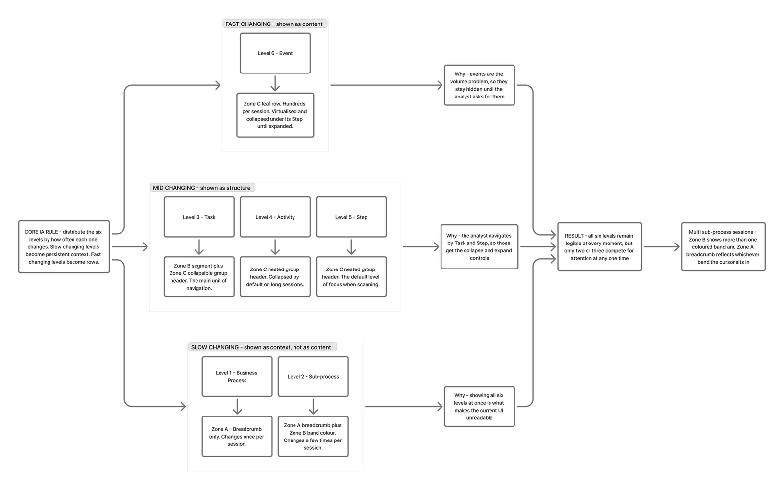
Six hierarchy levels, distributed across the layout by how often each one changes.
I started out treating the six levels as a display problem, which is where I think the original went wrong too. The thing that actually mattered was how often each level changes.
Business Process changes once per session. Event changes hundreds of times. Giving them the same visual weight in the same list is what made the original hard to read. So I sorted the six levels by how often each one moves, and gave each group a different home in the layout.
| Band | Levels | Where they live |
|---|---|---|
| Slow | Business Process, Sub-process | Persistent breadcrumb and the session map band colour. Never scrolls |
| Mid | Task, Activity, Step | Collapsible group headers inside the stream. The main unit of navigation |
| Fast | Event | Leaf rows. Virtualised, collapsed by default, expanded on request |
Only two or three levels compete for attention at any moment, even though all six are always present and always correct.
Five zones, each with one job
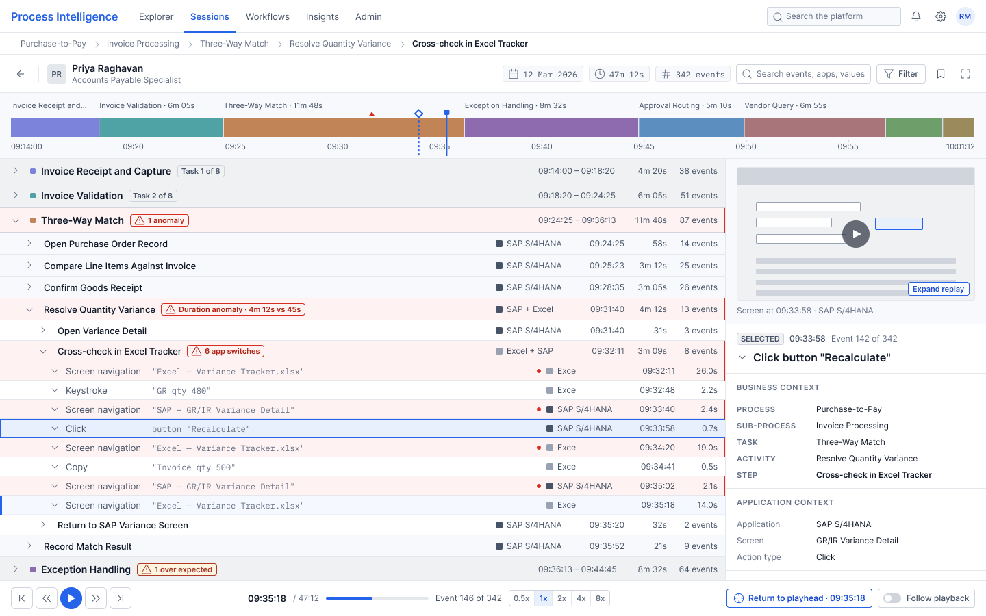
| Zone | Name | Position | Job |
|---|---|---|---|
| A | Context Bar | Full width, fixed top | Breadcrumb, participant identity, session metadata. Answers where am I in the process |
| B | Session Map | Full width, never hides | Whole session on one time axis, eight task bands, anomaly marker. Answers where am I in this session |
| C | The Stream | Left column, the only scrolling zone | Nested outline of Task, Activity, Step and Event with sticky group headers |
| D | Inspector | Docked right panel | Screen capture, business context, duration against expected, event signals |
| E | Transport Bar | Full width, fixed bottom | Play, step, skip, speed, Follow Playback, Return to Playhead |
Zone B is the one I would defend hardest. It never hides, on any screen or in any state, including full screen and every edge case. That was a deliberate constraint I set early and then held to, because the moment the session map disappears the analyst is back to reconstructing where they are, which is the thing I was trying to fix.
06 | The Interaction Model
Playback position and selection are two separate cursors, rendered so they can never be mistaken for each other.
The hardest interaction question in this feature is what the relationship is between where playback has reached and what the analyst is currently reading. Get it wrong and someone pauses to inspect an event, then cannot find their way back to where the session was running.
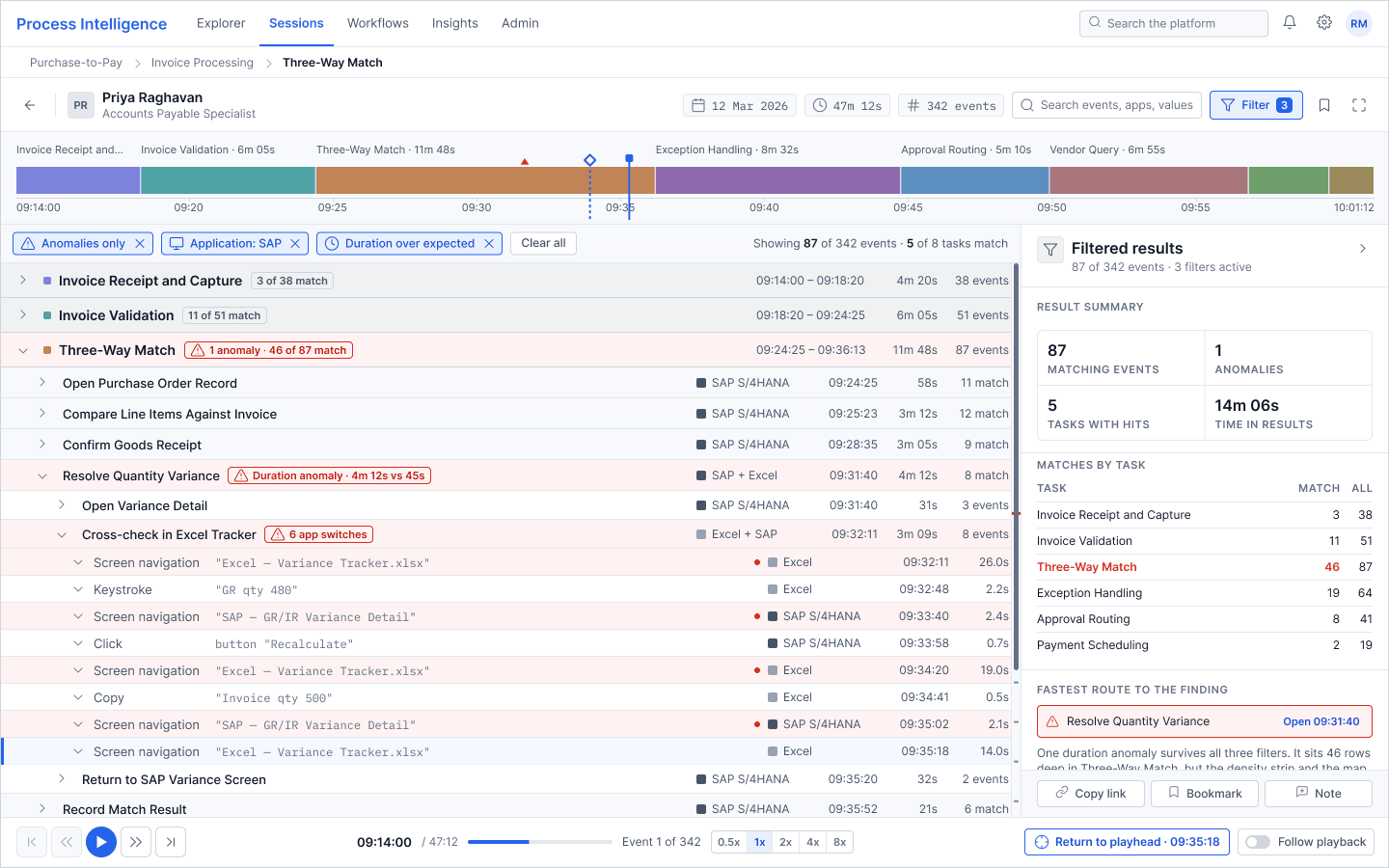
Playback moves on its own. Selection only moves when you click. I made them two visually independent objects with two different rendering languages, so they can sit next to each other on the same screen and still be told apart at a glance. In practice, that means the marker showing where the recording currently is looks nothing like the marker showing what you clicked on, so the two are never confused even when they land close together.
Playhead
Where playback currently is
| On the session map | Solid vertical line with a solid cap on top |
| On the stream row | Left edge bar, pale tinted row background, no border |
| Moves | On its own, during playback |
Selection
What the analyst is inspecting
| On the session map | Hollow outlined diamond marker |
| On the stream row | Filled background with a full border on all four sides |
| Moves | Only when clicked |
Focus is a third state. It renders as an offset ring, so keyboard position can never be mistaken for either cursor.
What happens when the two separate
With Follow Playback on there is one cursor rendered two ways. Click any event and three things happen at once. Playback pauses. Follow switches off. A Return to Playhead button appears in the transport bar carrying the exact timestamp you left.
You can always get back. That button is the reason the analyst is willing to click away in the first place.
07 | The Session
I designed against a single realistic session and used the same data on every screen, so the whole set reads as one investigation rather than six unrelated mockups.
Priya Raghavan, Accounts Payable Specialist · Session SES-2026-04817 · 12 March 2026, 09:14 to 10:01 · 47m 12s · 342 events · Purchase-to-Pay › Invoice Processing
Eight tasks, in process order, drawn on the session map in proportion to how long each one actually took.
| Task | Duration | Events | |
|---|---|---|---|
| Invoice Receipt and Capture | 4m 20s | 38 | |
| Invoice Validation | 6m 05s | 51 | |
| Three-Way Match 1 anomaly | 11m 48s | 87 | |
| Exception Handling | 8m 32s | 64 | |
| Approval Routing | 5m 10s | 41 | |
| Vendor Query | 6m 55s | 33 | |
| Payment Scheduling | 2m 48s | 19 | |
| Posting and Close | 1m 34s | 9 |
I reserved red entirely for anomalies. It appears nowhere else in the interface, on any screen, for any other purpose, which is what lets the marker read quickly without needing a legend.
08 | The Screens
Each one exists to prove a specific thing holds up, not to show a different colour of the same layout.
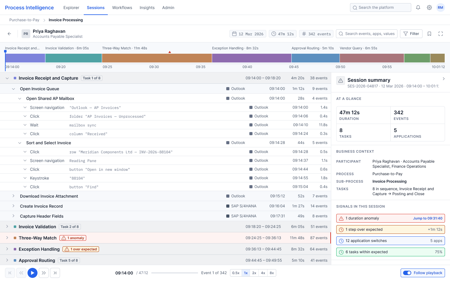
01 · Default loaded state
Session open, nothing selected. Task 1 is expanded so the four-level nesting is visible straight away, and the inspector opens with a session summary and jump links to every signal in the session.
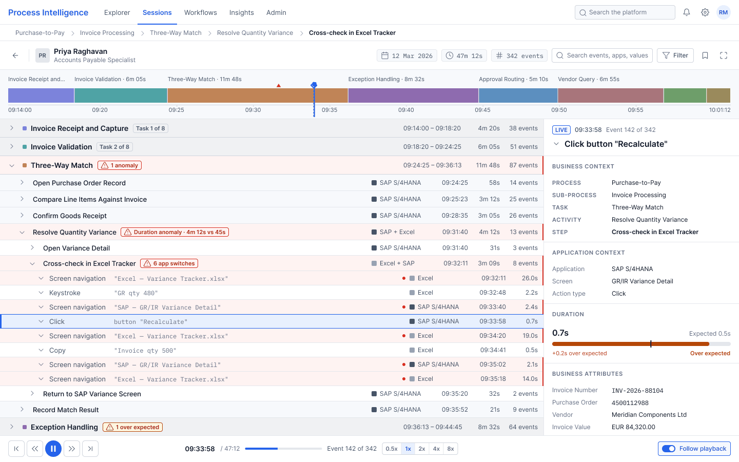
02 · Playback active
Playback running at 09:33:58, inside the anomaly. Follow Playback is on, so selection tracks the playhead and the inspector carries a LIVE badge. The stream has auto-scrolled and expanded to the playing event.
03 · Event selected
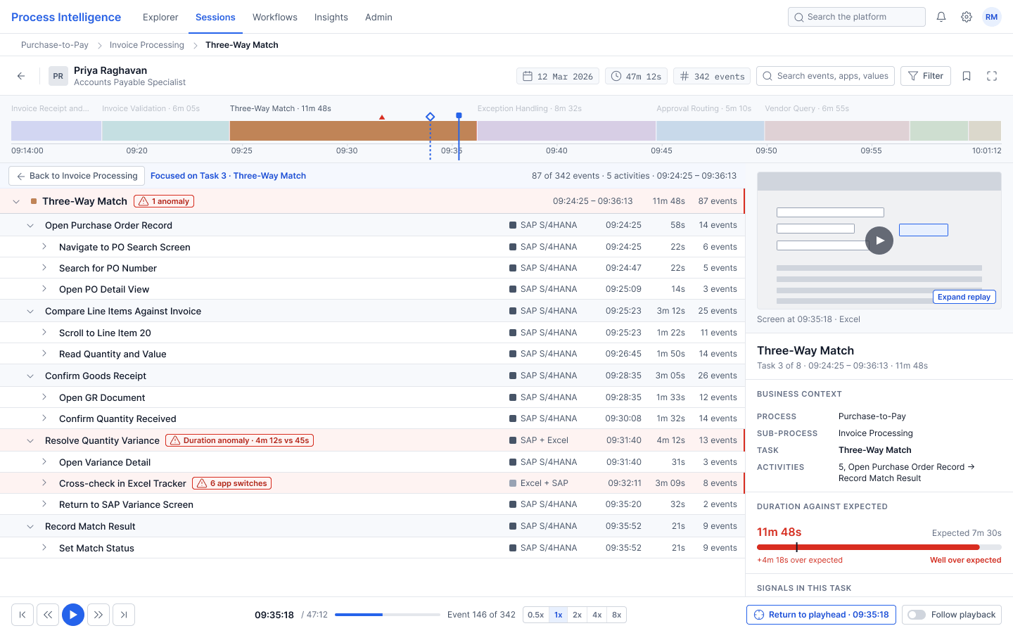
The state that matters most. Playback is paused at 09:35:18, the selection sits at 09:33:58, and the two are rendered differently enough that nobody has to squint at them.
04 · Hierarchy level focused
Drilled into Three-Way Match. The other seven task bands drop to 30% opacity but stay on screen, the breadcrumb extends, and the inspector switches to a task-level summary. The playhead does not move.
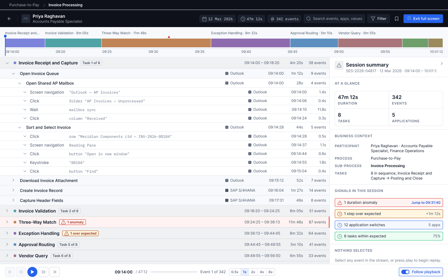
05 · Full screen expanded
At 1920 pixels the platform navigation goes away and the space gets spent on information rather than on scaling everything up. The session map gains an application focus lane. The stream gains App, Action Type, Time and Versus Expected columns. A third column appears for the activity summary.
06 · Long session, filtered
Three filters active: anomalies only, application SAP, duration over expected. The result count reads 87 of 342 events, 5 of 8 tasks match. The inspector adds a Fastest route to the finding block pointing straight at Resolve Quantity Variance.
09 | Edge Cases
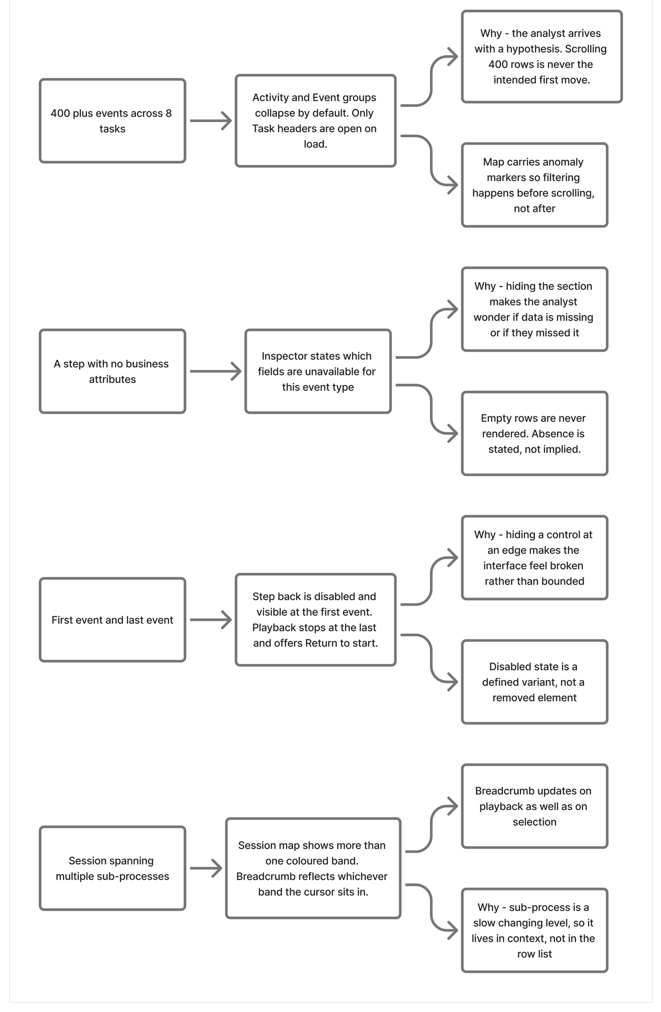
Dense interfaces fall apart at the edges. These three were the ones most likely to break the two-question promise.
An event with no business metadata
The inspector never renders empty rows and never falls back to a shrugging illustration. It labels inherited values as inherited, names each field that was not captured for this event type, and points forward to the next event that does carry them. Rhea has to explain gaps in a director's deck, so the interface has to tell her exactly what the gap is.
First and last event
Back controls sit visibly disabled at event 1 of 342 rather than disappearing. At event 342 the forward controls disable and a Playback complete label appears with a Return to start action. Controls that vanish make people think something is broken.
A session spanning multiple sub-processes
The session map grows a thin upper band for sub-process grouping. The breadcrumb resolves to whichever sub-process the cursor currently sits inside, and updates as you drag it. One map, two levels of grouping, no extra chrome.
10 | Trade-offs
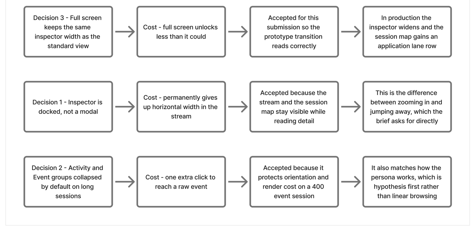
Four things I gave up on purpose, and what each one cost.
Every one of these cost something real. Writing down the cost is the only way to know whether the call was right.
I removed the left sidebar
Cost
Five navigation items had to move into a slim top bar, and platform navigation lost its usual home.
Why I took it
Celonis does it, UiPath does it, and Skan's own product does it. It was costing 300px of horizontal space on a screen whose entire problem is horizontal space. That 300px went to the stream and the inspector, which is where the analyst actually works.
I moved the screen recording out of the centre
Cost
The recording stops being the first thing you see.
Why I took it
Putting the recording in the middle is what squeezes the event stream into a narrow rail, and the narrow rail is what truncates the labels. So the recording became a thumbnail on the selected event inside the inspector, and a full pane in full screen mode. The capability is all still there. Only the priority flipped.
I docked the inspector instead of making it a modal
Cost
Roughly a quarter of the stream width, permanently.
Why I took it
A modal takes you out of the session. A docked panel keeps you in it. I wanted the stream and the session map to stay visible while the analyst reads the detail, so that inspecting something never costs them their position, and I was willing to pay stream width for that.
I collapsed activity and event groups by default on long sessions
Cost
One extra click on every drill-down.
Why I took it
On a 400-event session the alternative is a wall of leaf rows with no shape to it. Collapsed by default means the task layer reads first, which matches how Rhea works. She filters, then browses. She does not scroll from the top.
One more worth stating plainly. Full screen kept the inspector at the same width as the standard layout. In production I would widen it. I held width parity here so the prototype transition reads cleanly, and I would rather say that than have someone find it.
11 | Design System
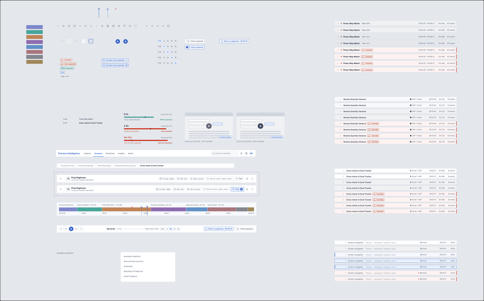
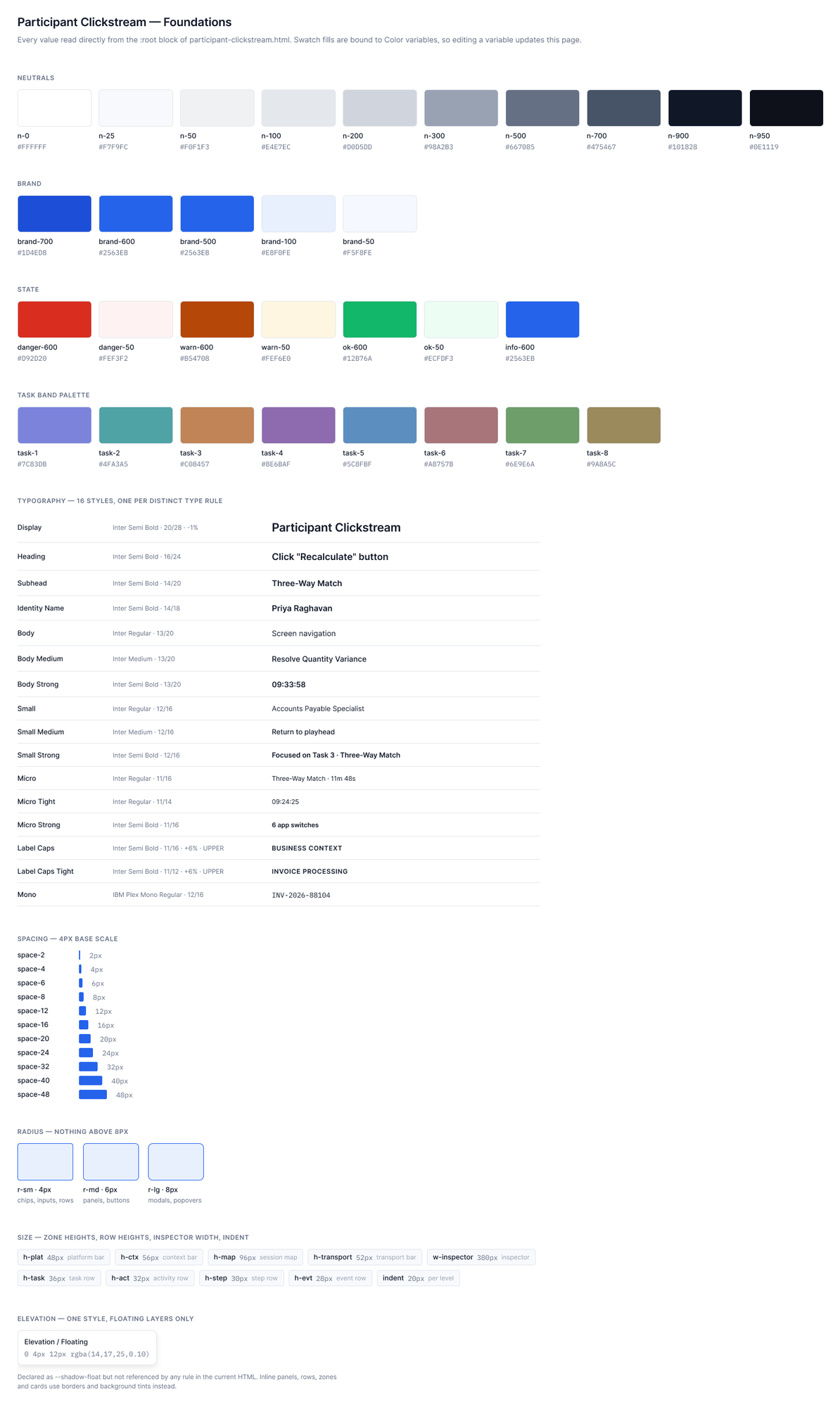
Nothing on any screen is a hardcoded value. Colour, type, spacing, radius and size all resolve to a bound variable, which is why six screens stay consistent down to the pixel.
Colour
The palette is derived from Skan's existing product interface so the redesign reads as the same product rather than a different one. The primary blue appears once per screen as the interactive focal point. Red is reserved entirely for anomalies and is used nowhere else. Duration carries three states: within expected, over expected, and well over expected. The eight task band colours are muted categoricals, picked so that none of them can be mistaken for the anomaly red.
Type and spacing
Inter for the interface, IBM Plex Mono for timestamps, IDs and raw values so that numbers align in a dense table. Hierarchy comes from weight, size and colour working together, never from size alone. Spacing runs on a 4px base scale. Row heights step down by hierarchy level, from a task row at the top to an event row at the bottom, and that compression is what lets twenty or more rows sit on screen at once.
Components
Every repeated row is an instance. Task Group Header, Activity Group Header, Step Group Header and Event Leaf Row each carry explicit variants for default, hover, selected, playback active and anomaly. The variant set is the reason the two-cursor model holds together across six screens without drifting.
Accessibility
I checked contrast against WCAG 2.2 AA across the task band palette and for text sitting on tinted rows, and adjusted a few of the band colours where they came up short. Colour is never the only carrier of meaning, so an anomaly row also gets an icon and a label. The three row states differ by position, fill and border, which is three separate mechanisms rather than three shades of the same one. Focus is a distinct third state, so keyboard position cannot be mistaken for playback or selection.
I have not put any of this in front of a screen reader user or run a keyboard-only session with a real analyst. Those are checks, not validation.
12 | Prototype & Source Files
The prototype below is live. Click through it, or open any of the source files directly.
Interactive prototype
Source files
13 | Research Artifacts
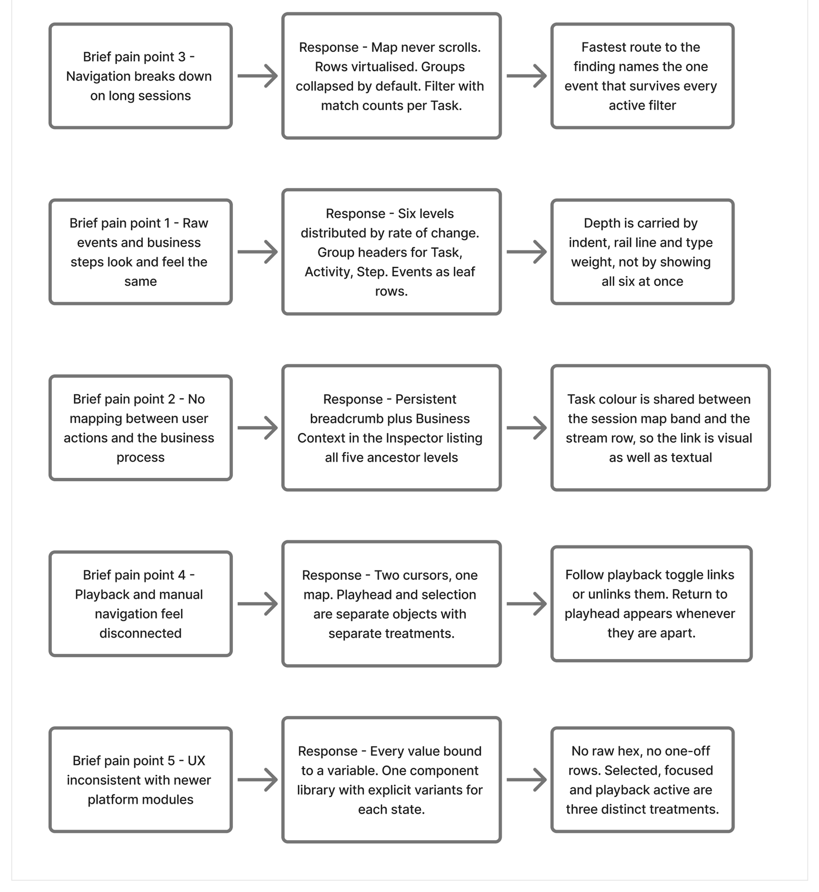
These are the actual boards, not tidied-up versions made for this page.
14 | Reflections
This was two days against a specification, with no users to talk to and nothing tested. Four things I would want before calling any of it settled.
Check the persona. Rhea carried a lot of weight here and she is built on inference. Half a dozen conversations with real process analysts would either confirm the assumptions or send me back to the IA, and I would want that before building anything.
Test the two-cursor model. I am confident the two states are visually distinct, because that is a craft problem and I can see the result. I am much less confident that the idea of playback continuing while you read something is intuitive on first contact rather than something you pick up on the third session. That one needs people, not judgement.
Check the density at real desk sizes. I designed at 1440 and 1920. I assumed two screens, but plenty of analysts work on a single 13-inch laptop, and a 28px event row is a different proposition there.
Widen the inspector in full screen. Holding width parity was the right call for a submission and the wrong one for production.
If you want to see how I handle a similar density problem in a regulated environment, the Compliance Manager case study covers it.
The one thing I would keep regardless is the rule I set at the start. Separate time from structure, then keep the two in sync. It held up through every screen and every edge case I threw at it, which is the most I can honestly claim for it at this stage.
Explore More Projects
Check out some of my other recent design work on Behance
PhonePe: Making Spending Smarter
Designed an Expense Manager feature for PhonePe's UPI platform, helping users track spending and make smarter financial decisions.
View on BehanceFinIQ Personal Finance App
End-to-end UX/UI design for a personal finance management mobile app.
View on Behance